FRAMER
Case Study
Building the VH Design System
Overview
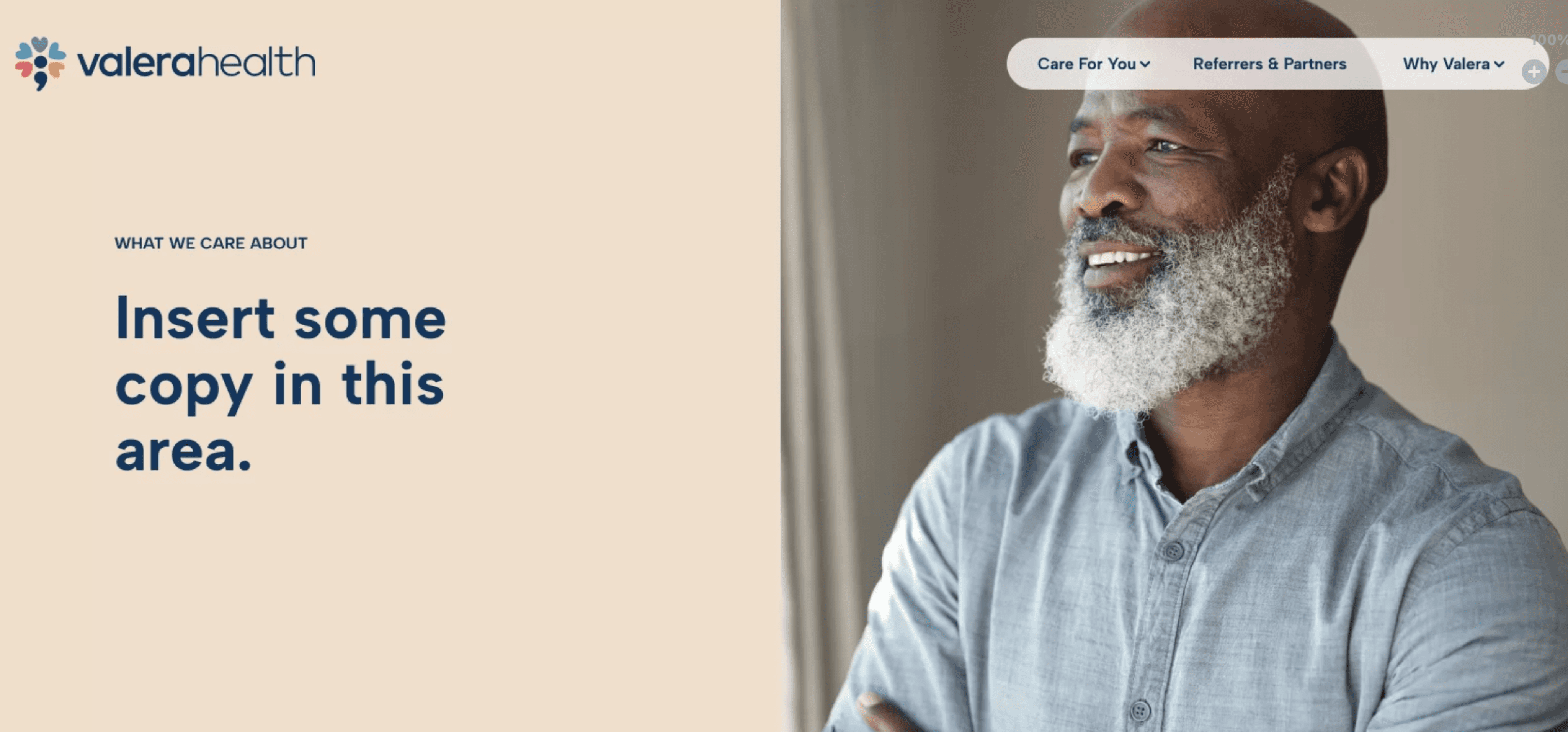
Valera provides comprehensive mental health treatment to adults and adolescents across the full spectrum of behavioral health severity and complexity. The Valera mobile app allows patients to easily manage their mental healthcare journey on the go, but the outdated design system it was built with was stifling its potential for growth and feature expansion.
Scope
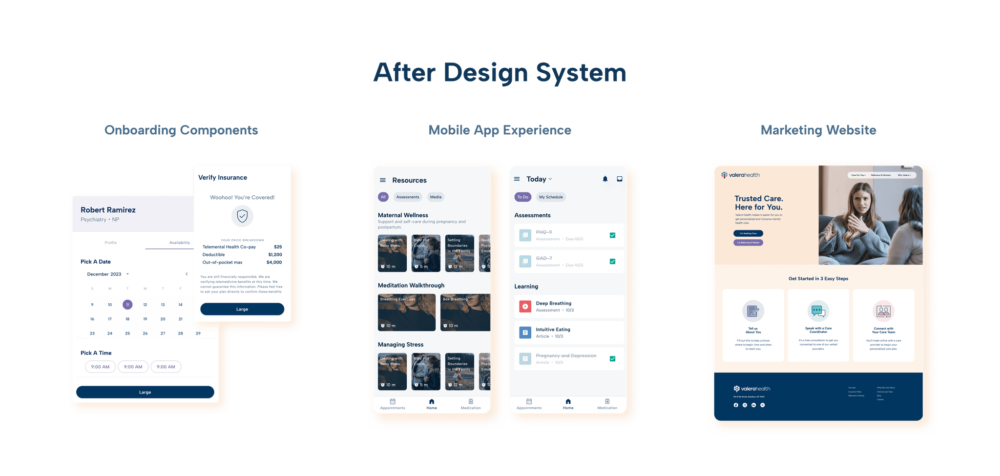
Unifying the look and feel of the Valera family of patient-facing products, but keeping functionality (mostly) the same.
However, we will be adding functionality in the future, so we need to think strategically about how to build a system that is versatile and flexible enough to build future functionality out.

Background
Maturing Our Brand
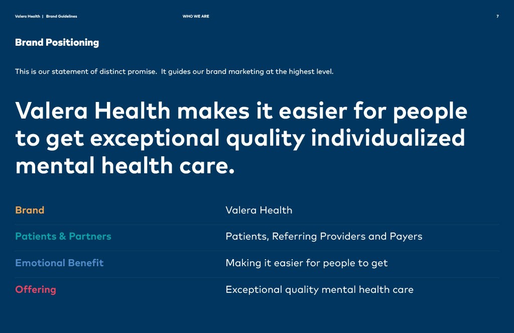
In late 2023, we realized our brand identity was no longer suiting our needs. Our website and logo needed an update, so we successfully pitched to the executive team and recruited a branding agency, Greybox, to consult us through a plan to redesign our logo, rebuild our website, and refine our brand identity and voice.
I worked closely with Greybox and together we developed a detailed brand guide, including new typography, color palettes, and design elements. They assisted in shaping a clear brand personality and voice, which would become essential to me in creating the new design system.

The Problem
Inconsistent Patient Experience Across Platforms
At this time our patient app was relying on a basic UI kit that failed to meet the evolving needs of our users. It was clear to me that if we were going to effectively scale the product, we needed a comprehensive design system. Our lack of mobile design system resulted in inconsistencies across features, components that failed accessibility standards and confusion during the handoff process.
As a small team with limited development bandwidth, the prospect of overhauling the patient app with a brand new design system was a daunting task for our developers and engineers. I would need to communicate why this was a worthy use of their time and get by-in from all the stakeholders involved in order to make any headway.
The Opportunity
Capitalizing on Momentum from the Rebrand
By positioning the new design system as an extension of our brand evolution, I was able to effectively communicate its importance to the C-suite and product team during our brand meetings.
Stakeholders Involved
C-suite: CEO, Chief Medical Officer, ....
Director of Product
Developers of the Mobile App
Engineering
Marketing Department
Stakeholders Involved


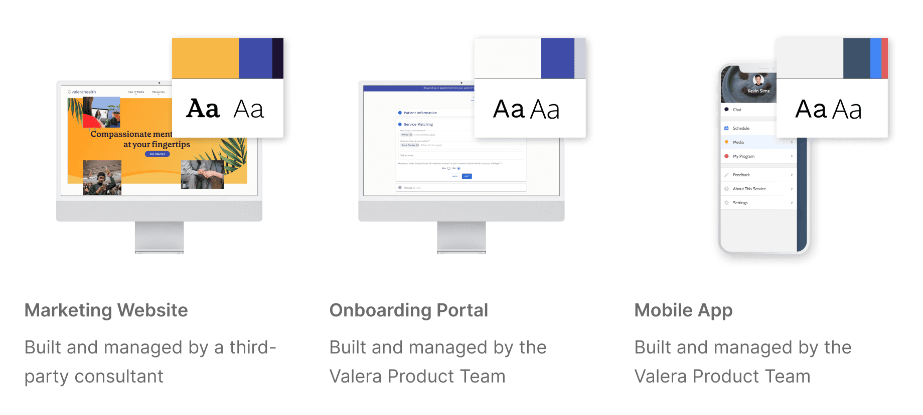
Inconsistent and Inefficient Scaling Across Platforms
Each of the three different patient-facing platforms was following a different style guide with different type and color styles.
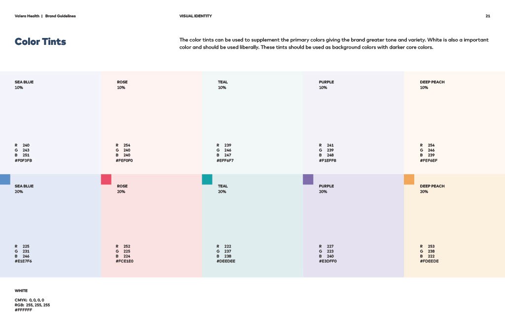
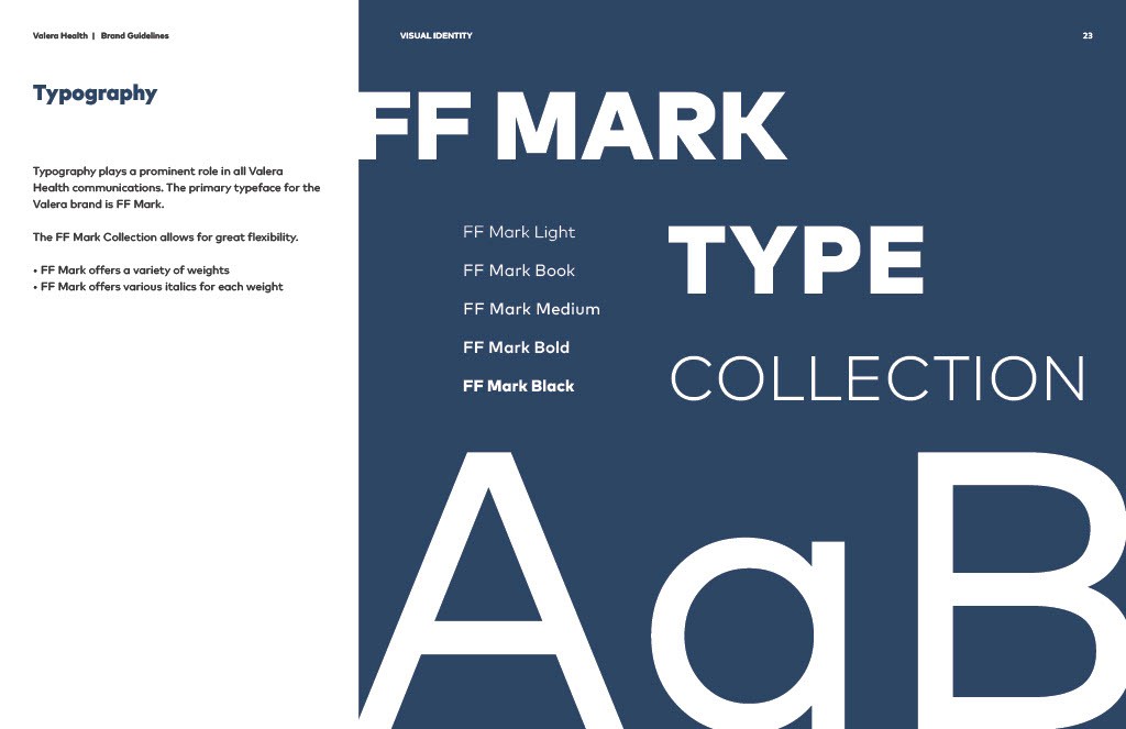
There were limited guidelines for the use of foundational design elements like typography and color palate.
(Mobile App) There were no standards for handoff process. Instructions as to how UI should be implemented were pretty much nonexistent.
Inefficient Component Planning and Organization
Many of the Figma files for foundational UI screens didn’t even use components or auto-layout, making the UI elements almost impossible to repurpose.
The components we did have were designed as one-offs rather than sophisticated component sets. This meant that we weren’t accounting for variant properties like size or state and we definitely weren’t thinking about how that component might be used in the future.

Design Solutions
Base UI Material
x
Design Solutions
Components that Communicate
As the sole designer working on the patient mobile app, I was building this design system in tandem with other important product design work. Throughout my conversations with the head of Product, it became clear that for the system to be scalable and efficient, I’d need to build a library that was modular and flexible, so the components could be easily repurposed. I closely studied Brad Frost’s Atomic Design Approach which became fundamental to the anatomy of the elements in our design system.

Design Foundations
x
Typography
Typography
Something that became apparent throughout a close examination of DSV1 was the lack of clear visual hierarchy on several pages of the mobile app. The type scale being used was very small (only 1.1 px) and the Headline text only went up to a max of 20px. In order to create more variation in type size, we bumped the typescale up to 1.2 px. In order to adhere to WCAG recommendations, it was important for us to keep the baseline text at 16px.
New Design System Type Styles

Framer 2023
Amsterdam