My Role
Product Design
Company
Valera Health
Duration
January - May 2024
(4 months)
Project Type
Mobile-First Web
B2C
Overview
Humanizing the patient enrollment experience while getting patients connected to care faster.
Valera aims to provide comprehensive virtual mental healthcare to people of all backgrounds and levels of severity. The crux of any accessible patient experience is a low barrier to entry. Our patient onboarding process was turning users away and leaving some who completed it unsatisfied, with some waiting weeks before even getting an appointment on the calendar.
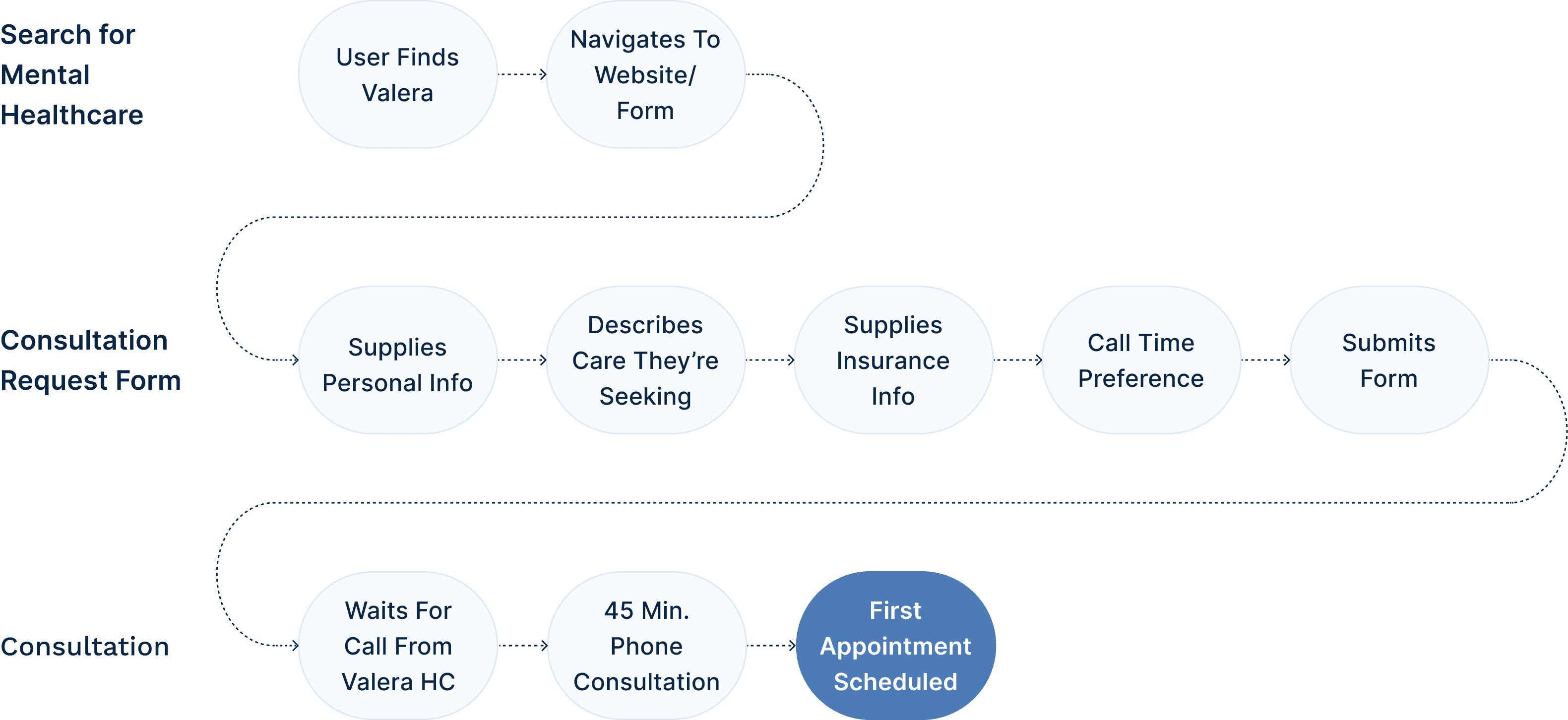
The Typical Patient Onboarding Journey at Valera Before
The Problem
Our onboarding process was losing prospective patients at the top of the funnel.
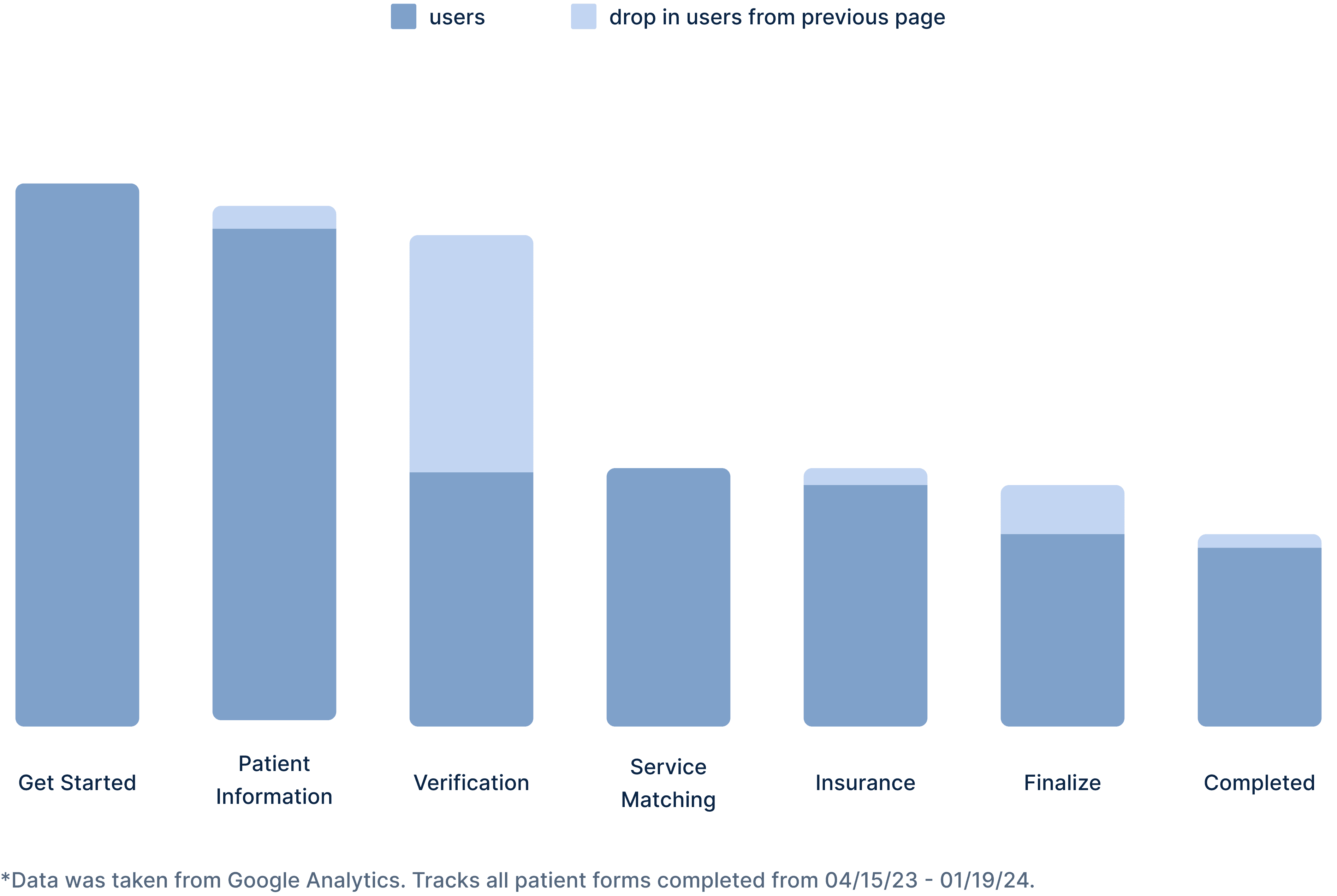
Only one third of users who started our consultation request form were finishing it. This meant we were losing prospective patients at the top of the funnel, before the consultation was even attempted. Looking at the chart below, we see that by far the largest drop was completing the patient information section and moving on to the verification section (43%). The drop rate from the insurance to the finalize section was also substantial and worth noting (21%).
Drop-off Rates of Original Patient Onboarding Form
The Problem
Phone-tag was leading to wasted company resources, long waitlists and frustrated patients.
Problem Statement
How might we empower and support those seeking mental health treatment?
Research
We conducted ethical research to understand user behavior while respecting patient privacy.
HIPAA Compliance
HIPAA is a federal law that protects health information and sets standards for electronic health information. When conducting user research, it was of the utmost importance that we did not violate any rules under HIPAA.
Clinical Discussions
I conducted interviews with clinicians (therapists, psychiatrists, etc.). I learned about the experiences of their patients during the enrollment process and what lead them to seek care.
Patient Interviews (Non-Valera)
I spoke with individuals who were currently or previously attending therapy or psychiatry sessions from a non-Valera mental healthcare provider.
Usability Testing
To understand how users were interacting with the existing and proposed forms I conducted moderated testing sessions with the live onboarding form and lo-fi prototypes.
Intake Form Analysis
Using anonymous data from QuickSight, I was able analyze thousands of patient intake forms.
Secondary Research
Competitive Analysis
In order to better understand the landscape, I completed a competitive analysis of the onboarding processes for 10 other mental healthcare providers.
Literature Review
Reviewed case studies of successful onboarding strategies and re-familiarized myself with best onboarding practices and the Laws of UX like Hick’s Law and Cognitive Load.
Insights
Some patients didn't trust us yet.
A point of resistance for some patients was the risk involved with giving away their personal information like their phone number and email address. One of my key findings from the patient intake forms was that many prospective patients are distrusting of healthcare providers/systems due to previous negative experiences (waitlist, discharge, etc.). This meant that we would need to earn their trust before expecting them to give away personal information.
Requesting too much information at once was overwhelming our users.
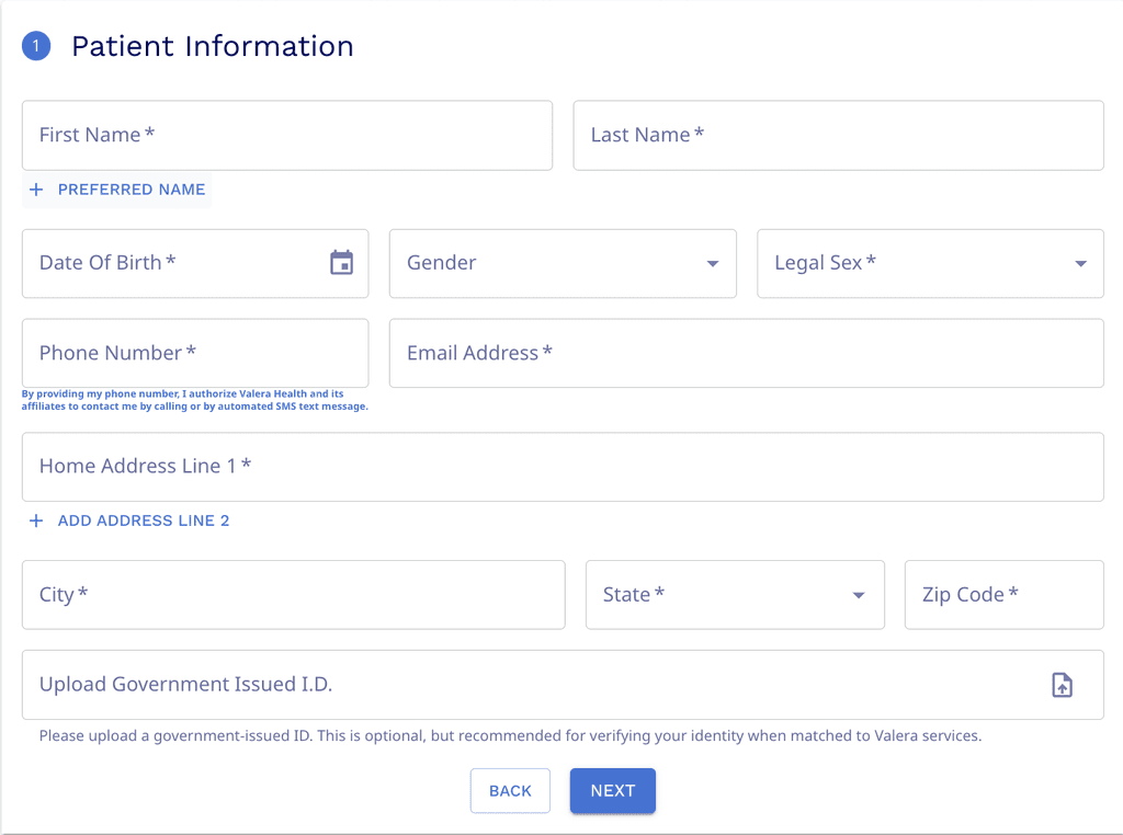
During the user testing sessions, it became clear that this section was the most tedious and time consuming. They would have to complete 12 different fields and upload a picture of the their ID to move on to the next task. Starting the flow with the most complex step was squashing users' momentum.
Cost uncertainty is a blocker for prospective patients.
User interviews revealed that many patients feel confused by what services are covered by insurance or frustrated by the lack of transparency and simplicity surrounding the topic of insurance.
Design Iterations
Testing showed that users preferred having some degree of choice when it came to their providers.
We experimented with 3 different types of onboarding flows: a browsing model, a matching model and a hybrid model. We conducted usability tests with low fidelity wireframes. We found that a combination of matching + browsing fit user and business needs best.
Solution
Give patients the power to schedule
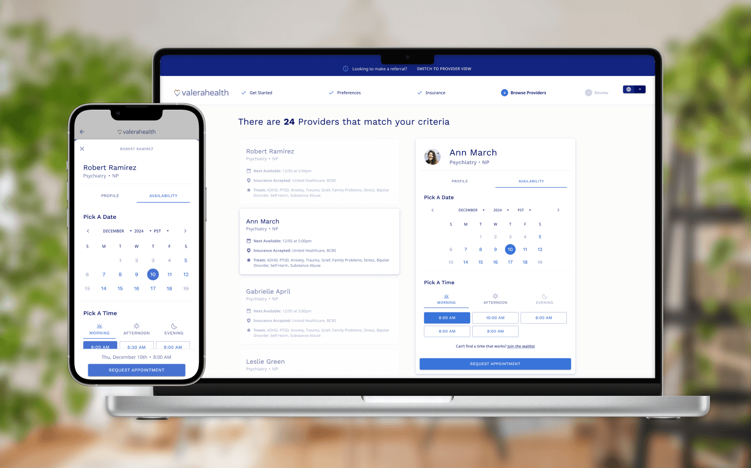
In our redesign we introduced direct-to-provider scheduling. Users would receive a their provider matches after completing only several required criteria fields. They then are able to select a provider based on their profile and availability.
Eliminate uncertainty with insurance verification
Giving Patients the Power with irect-to-Provider Scheduling
Opting for gradual engagement over a heavy UI
In my secondary research I learned about the principle of gradual engagement which suggests that postponing registration can help create a lower barrier to entry. We rearranged the onboarding flow so tedious registration-related fields come after the user schedules an appointment. This gives us a chance to demonstrate real value to user before asking them for their information.
Results and Conclusion
Lowering the barrier to entry to mental health services, one appointment at a time.
Direct to Provider Scheduling connected patients to care 5 days sooner on average than our previous onboarding model. The new flow received positive feedback from my colleagues. One of our developers said "This is the best iteration of out patient onboarding by far." And members of both the C-suite and the Clinical team said it was a dramatic improvement from the most recent version.


